
eCommerce Quick Tip: Sticky Add to Cart

0 min read
Leah Wagner
Detecting when a specific customer is ready to make a purchase in the online space is, well, next to impossible. This is where sales associates in physical stores have the advantage. On the bright side, modern technology has given us the ability to identify general patterns and behaviours, but the problem is they are just that — general.
So, how do we make sure online shoppers have the necessary action-enabling elements they need when they are ready? What if we give customers the ability to act on their buying decision as it happens, whenever it happens?
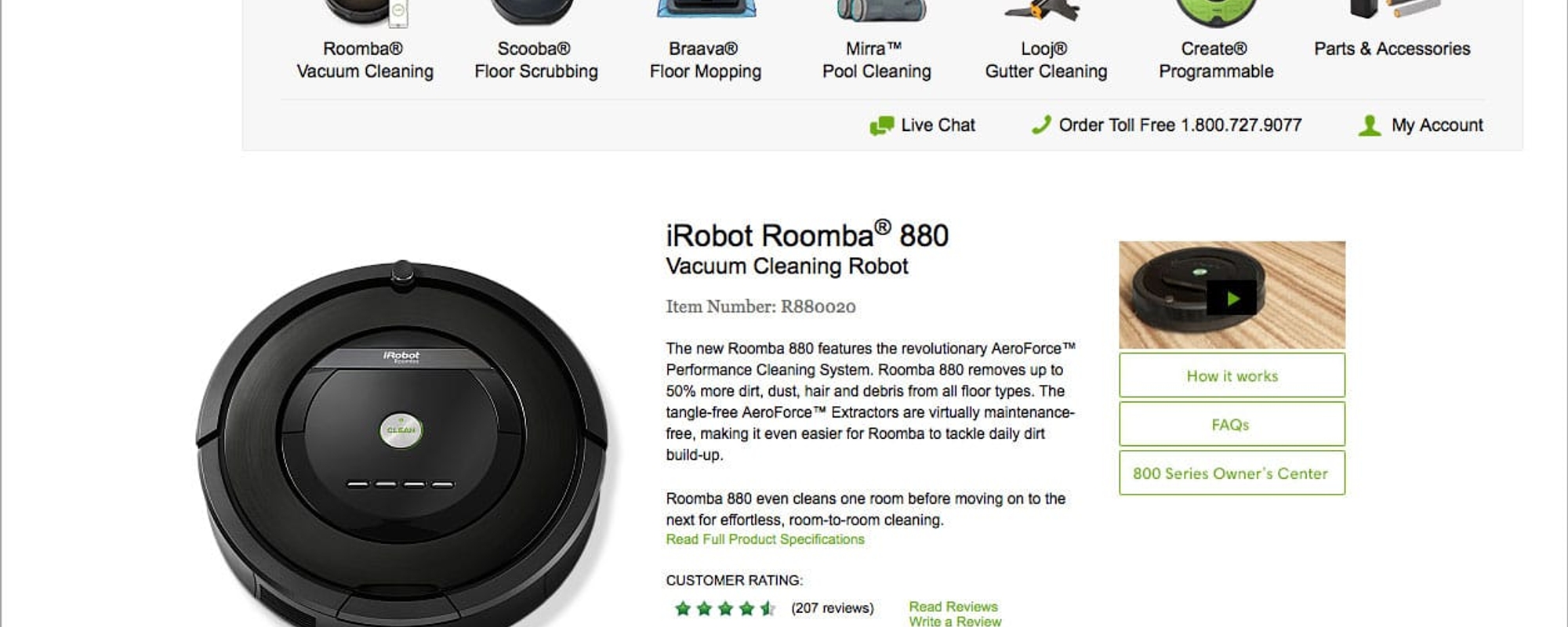
We recently saw a great example of this in action being implemented on the iRobot website. When landing on a product page, a customer will see what would be expected: an image, description, price, and an Add to Cart button. Further down the page, customers can get more information on product specifications and read customer reviews.
If a customer scrolls down to read more, the general consensus would be that they are further along in the decision process about the product. They already know what it looks like and how much it costs, and they are still looking for more information. However, on a typical website, the more they read, the further they move away from both the “Buy” button, and the ability to add this product to their shopping cart.
The sticky Add to Cart button
Whenever a customer has reached a decision to buy, you want the corresponding call-to-action (CTA) button to be on standby as close as possible. On the iRobot website, you see a nice user interface element that helps with this. As a customer scrolls down a product page, they will see a bar that is glued to the top of the page (hence the term “sticky”). This sticky bar gives the customer easy access to add the product to their shopping cart at any time.
Help but don’t hinder
Design decisions typically fall into two camps: increasing sales or improving UX. There’s nothing wrong with this until the decisions meant to increase sales start stepping on the toes of UX — we’ve all seen when elements like these can start to feel obnoxious and intrusive.
In our opinion, iRobot’s implementation of the sticky add to cart button achieves both goals without taking away from either. The element elegantly slides down so the shopper is aware it is there, but it doesn’t distract them from the task they were already performing.
iRobot gives a good ideal to aim for, but it’s not the only one. Keep in mind the balance between sales and UX whenever you have to make a pivotal eCommerce design decision.
Have you seen other examples of a sticky Add to Cart? Do you have any questions about this design trend? We want to hear your thoughts, so share your opinions below in the comments section now.
Check out our articles for more eCommerce tips.